
Facing It: Testing AI-empowered Mental Health Companion App
UX Research
Study Design
Key Goal
To evaluate how users interact with Facing It, a mobile app for managing social anxiety, and to identify usability issues, emotional responses, and opportunities for improving user engagement across core features.
Methodology
Sessions: 5 moderated user interviews (~30-45 mins each)
Approach: Open-ended think-aloud tasks (e.g., “What do you want to do next?”)
Prompting: Used only when a feature was not discovered organically
Evaluation: System Usability Scale (SUS) used post-session
Participant Snapshot
Age: 20–30
Gender: 3 women and 2 men
Mental Health Background: All participants live with social anxiety; ~50% have tried clinical therapies
Key Findings and Insights
What Users Loved
- All participants shared excitement that there is a tool available to help them conquer social anxiety
- Personalization during Onboarding – all participants reacted positively to the message that the app is being set up for the personalized experience
- Science behind the app – all users appreciated the fact that the app is backed by real academic studies
“I’ve never seen anything like this for people like me.”
Participant 3

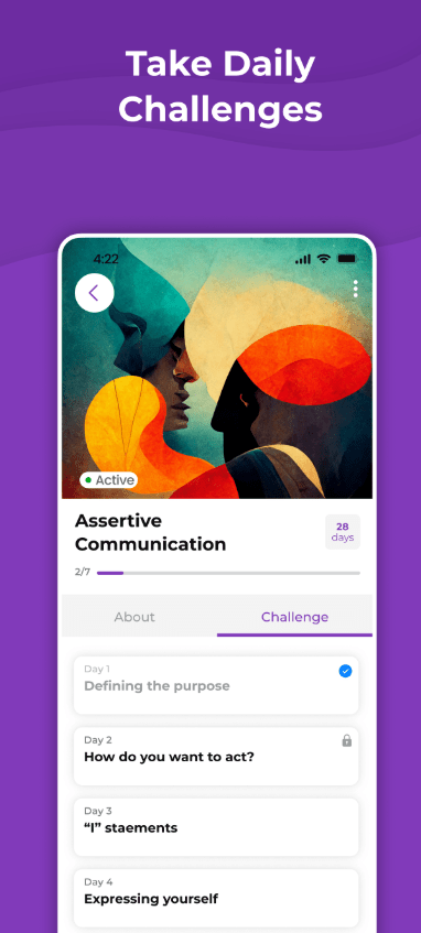
Daily Challenge
- Not immediately visible despite its top-screen placement
- Often referred as Calendar
- The manual input of personal challenges was a significant pain point; users felt unsure how to begin
- Users expected step-by-step guidance or examples
- Some looked for emotional support language when setting emotional states like “Terrible”
- The value-alignment question was perceived as confusing or overly abstract
- Lack of clear visual distinction between completed vs. outstanding tasks
“I don’t know what I’m supposed to write. Am I doing it wrong?”
Participant 1
Exercises
- Highly engaging; often the first feature users explored
- Compared favorably to Calm and podcasts
- Voice was calming, but robotic tone affected immersion
- Many would use it during commuting or mental breaks
“I like this feature, would listen to it on the way to work”
Participant 5

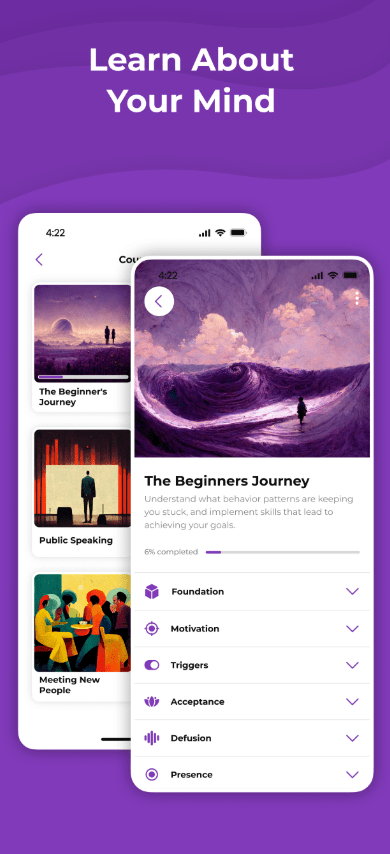
Beginner Journey
- Users encountered this section after exploring other features, creating confusion
- Many dropped off due to a bug with the navigation arrow
- Several suggested merging it with a tutorial or showing it earlier
“It actually doesn’t make sense…I’m seeing this part of the app after I tried out other features”
Participant 2
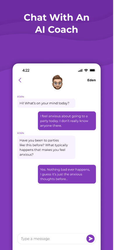
Eden (AI Companion)
- Hesitation due to AI stigma and prior negative experiences
- Those who interacted found it “OK,” but noted grammar errors and predictable replies
- A few appreciated its presence but preferred contextual integration across the app
“It’s nice, but it feels like I’m talking to a bot. I’d rather have guidance in other places.”
Participant 4
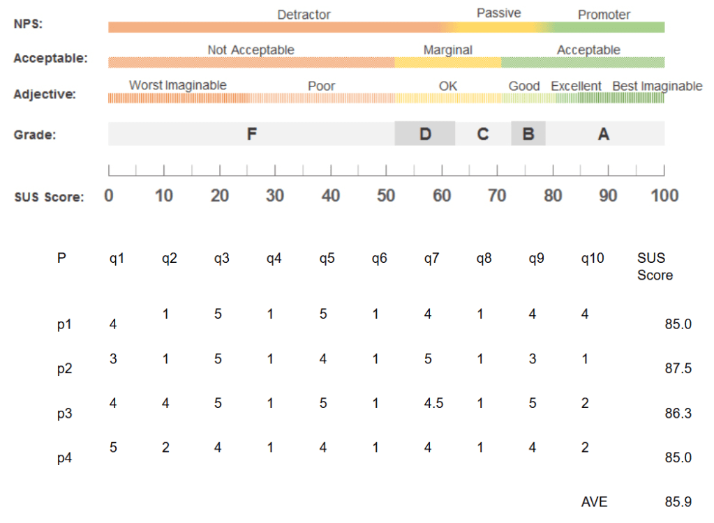
System Usability Scale (SUS)
To evaluate user perceptions of a app usability, we used SUS. Score ≥ 85 falls in the top quartile making the app easy to use, according to participants. It’s worth noting the small sample size (N=5). SUS has demonstrated stable average score in several simulations, including the one conducted by Jeff Sauro, PhD.
SUS Scores and SUS Guide
Recommendations
- Reorder Feature Flow
→ Beginner Journey → Exercises → Daily Challenge - Improve Daily Challenge Usability
- Add sample challenges and walkthrough steps
- Highlight emotional feedback (especially for negative moods)
- Use distinct colors for completed vs. pending actions
- Enhance Eden (AI)
- Improve language model grammar and variability
- Embed Eden in key decision points across the app
- Refine Onboarding + Tutorial
- Surface Beginner Journey early
- Introduce optional micro-tutorials at critical moments
- Visual & Technical Fixes
- Fix known navigation bug
- Adjust color scheme to improve clarity for key elements
Next Steps
- Collaborate with product and design to prototype new feature flows
- Conduct A/B tests on reordered journeys and microcopy adjustments
- Re-test with a new user group post-implementation