Mayo Clinic: Enhancing Education Platform for Cardiovascular Practitioners
UX Research, Report Example (Qualitative Methods)
Study Objectives
- Identify key factors that impact cardiovascular physicians’ decision to attend online on-demands CME courses
- Reveal cardiovascular physicians’ attitude toward on-demand CME courses elements: content, faculty, course structure, and course dashboard.
- Detect opportunities for improving the dashboard for Mayo Clinic on-demand cardiovascular CME courses.
Methods
User Interviews along with Usability Testing were employed in the study. During the first half of the one-hour long study session, participants were asked general questions about their motivation and considerations when taking on-demand courses as well as prompted to reflect on their most recent experience with any on-demand course.
The remaining session time was dedicated to observing participants interact with the dashboard for on-demand Cardiovascular Board Review. During this process, respondents were prompted to share feedback about their digital experience.
Participants Snapshot
9 cardiovascular physicians (7 men + 2 women)
4 participants were familiar with the Mayo Clinic cardiovascular on-demand CME courses, 5 respondents haven’t taken any Mayo Clinic on-demand course but took at least one on-demand cardiovascular course with another education provider in the past three years.
2 participants are Fellows, 2 physicians have 1-9 years of practice, 5 respondents have been practicing for 10+ years.
7 participating physicians are licensed in the US, two respondents are international practitioners.
Interview Results
CME Motivation Factors
Analysis of the answers given to the question about benefits of CME courses for cardiovascular career showed that gaining new knowledge relevant to the physician’s area of practice and mastering existing skills, besides getting CE credits, is the main driving force to take a CME course:
P1 “The topics were all very pertinent to my practice. There was a good mix of review of prior material that, you know, you would, would know from previous training along with newer, more cutting-edge lectures as well. So kind of combined refreshing what your knowledge should be and updating it with new material”;
P7 “…the knowledge we get from books or from university is of course very theoretical”
Takeaway: Make sure course content is aligned with the most recent trials/discoveries.
When choosing a CME course, physicians consider the topic’s relevance, professional interest, faculty expertise, and the education provider’s reputation:
P2 “…the number one thing is the, what the content is, and then who’s delivering that content. So, you know, if it’s someone that is prominent in the field or has some, you know, interest, unique insight or something like that. Especially for the talks that are on more contemporary topics for the board review…”
P4 “I do think the Mayo Clinic physicians, they’re a little bit more name recognized…”
P5 “I sign up for things that would impact the group of patients that with whom I care, the, the patients, something that I do”
Takeaway: Ensure a course description on the CV-CME website includes sufficient information about a topic and faculty.
Knowledge Quality/ Course Content
The perception of knowledge quality delivered in CME courses is tied to the degree of study goal achievement by the learner.
P2 “the vast majority of them [videos] were very good. You know, there were obviously like one or two that were not as helpful…some of them were a little bit too detailed with sort of technical details that were not relevant for the board review. They went probably too deep into the subject”
P1 “…some were also case-based presentations, followed by discussion of a panel of experts on the topic. So both, both were used and both were useful. It kind of broke up the cases, kind of broke up the monotony of the lectures, but also made it more practical and pertinent that the lectures supplemented and went more in depth than the case discussion did. So it was a nice mix of the two.”
Takeaway: Consider education customization, when learners can choose a topic and the depth of the studying process.
Instructor(s)
Not keeping the audience engaged during on-demand courses is the main concern that study participants share. Learners expect presenters to use different voice elements (i.e. volume, rate, pitch, fluency, articulation, and tone) along with applying speech techniques (e.g. jokes., etc.) to make sure they stay focused.
P9 “Jokes or like the random references that would just stick to your mind and how you can make connections.”
P6 “…some folks are perhaps not the most like animated or captivating…”
P4 “So the worst teachers are people to just sit there and read the slides. I mean, that’s not gonna be very helpful.”
P5 “I think in general, most of the instructors are the same. Some have the ability, I guess, to be a little more interesting or entertaining than others. Some can be rather dry’’
Takeaway: Provide support for faculty members to help them improve public speaking skills.
Slides/Handouts
Learners appreciate it when handouts/slides have just the right amount of information – balancing enough sufficient content and clean design. The images’ quality plays a significant role in reading satisfaction.
P1 “…keeping the slides readable, focused, but yet not, not too sparse. So there does need to be enough material on the slides or enough slides utilized that you are not completely dependent on what the person is saying that you can get it from looking at the slides. However, if you know, there’s small print, too many bullet points, that sort of things that makes it hard to read and you spend more time focusing on the slide and less listening to the speaker.”
P6 “often the points written on the PowerPoint, they are not complete without what they say to it. So I would recommend when they use the PowerPoint as a handout add speaker’s comments under slides”
P2 “I think that there are, there’s, I’ve seen sort of various compilations, but what ends up happening is then there’s too much stuff in there and it becomes a little bit overwhelming. So it’s like, I know it’s hard to find that balance of having the stuff that’s important but not putting too much there”
Takeaway: Make sure slide decks are easy to digest and readable on different screen sizes.
Course Structure/Study Modules
As physicians are always short on time, they need a very well-structured course, when all topics are compiled in a logical, cohesive way. That makes it easy to navigate withing the course
P2 “I think overall the modules were, were good. The only thing I would’ve been nice was that if there were chapters within the videos that you could, so you could jump to specific parts of the video.”
P6 “[topics] made sense, you know, it’s sort of, sort of a general overview. And then they started talking about like different chambers or different subjects within Echo that are used, you know, lv, RV
valve disease, pericardial disease, that sort of thing. So it was pretty, you know, easy to navigate and easy to follow”
Takeaway: Ensure the course topics/modules have a thoughtful structure, thus making it easier to navigate withing the course.
Course Dashboard/ Interface
Learners feel frustrated when they can’t easily access study content or need to spend a lot of time on learning how to use a course dashboard.
P2 “whenever I logged in, it wouldn’t go automatically through that. I had to go through like click three different things to get to the course”
P1 “The number of steps it takes to get to the lectures. I think the more steps there are, the more okay stages you have to go through to get to it, that can be frustrating and it also, you know, makes you less likely that you’re going to bring it up and look at the lectures. So reducing the number of steps to get to the material you want is, is helpful…”
P1 “..you’re trying to find the one that you want to use and so you have to scroll through so much and even then it’s sometimes hard to find where you were or get back to it. So making, making it easy to identify the lectures and easy to sign into them I think are the two biggest things”
Takeaway: Optimize the on-demand course dashboard operated by Med+Ed Manager to make sure its interface is aligned with users’ expectations, UX laws, and best practices.
Usability Results
The analysis of the real-time user interaction with the Mayo Clinic cardiovascular on-demand course revealed several problems. They are outlined below along with proposed solutions:
Problem 1. Overwhelming Home Page
Participants who saw this interface for the first time were overwhelmed by how busy the Dashboard Home page is. Their eyes were trying to catch a cue about a part of the screen containing information helpful for the task completion.
Solution 1. Less is more
Keep in mind the human short-term memory capacity is 7+-2, which means that people can’t process information effectively when more elements are presented. Therefore, limit buttons, menu options on the screen up to 9 (5-7 is the most optimal)
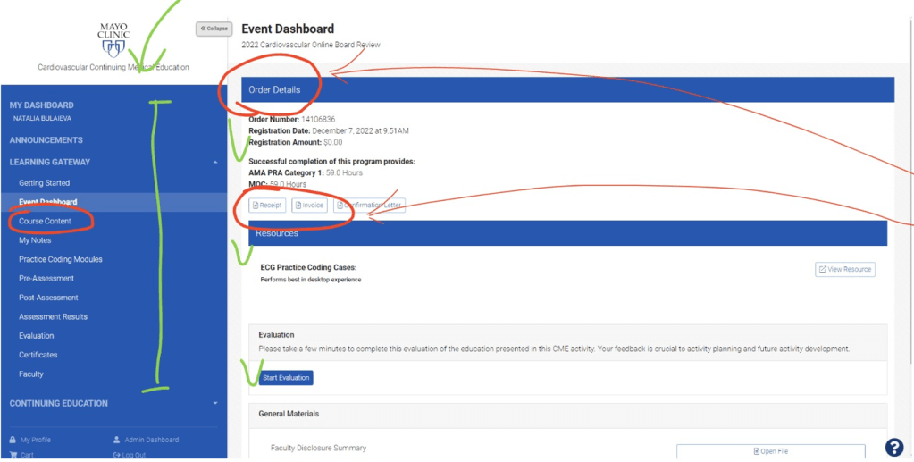
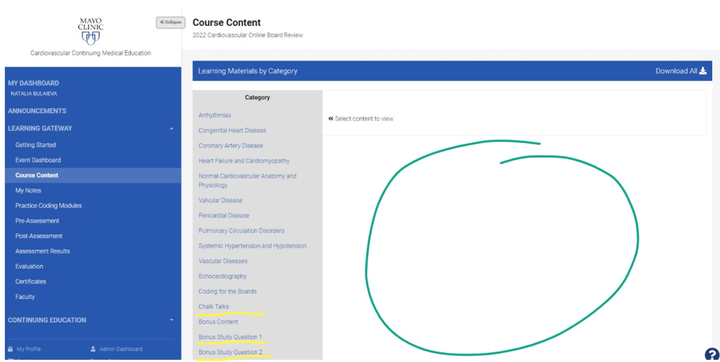
Problem 2. Content structure is not aligned with the core user task
All participants were given a task to simulate their normal behavior when accessing an on-demand CME/BR – to start learning. Participants were confused by the low visibility of the course content but highlighted secondary information – i.e. Order Details.
Solution 2. Help users find study content easier
Our learners come to us to acquire knowledge, Invoice and Confirmation Letter are important – however people’s primary task is learning. So, help users make as few clicks as possible on the way to the course content.
Problem 3. Too many clicks
Participants feel frustrated that they need to make so many clicks to get to the video of their interest. This contradicts the Heuristic #7 “Flexibility and efficiency of use” – even second time users’ needs to take the same route without prompts to start a video they left on from the Home page.
Solution 3. Create effective and natural user flow
Make sure users are offered the most optimal route to get to their destination by optimizing user flow
Problem 4. Users can’t easily find where they left
Many users can’t watch the entire video at once – but when they login to the dashboard a few days later, no identification is given on where they left.
Solution 4. Introduce timestamps and progress bar
Add timestamps to the video lessons and implement a progress check to help users navigate through content as they start studying

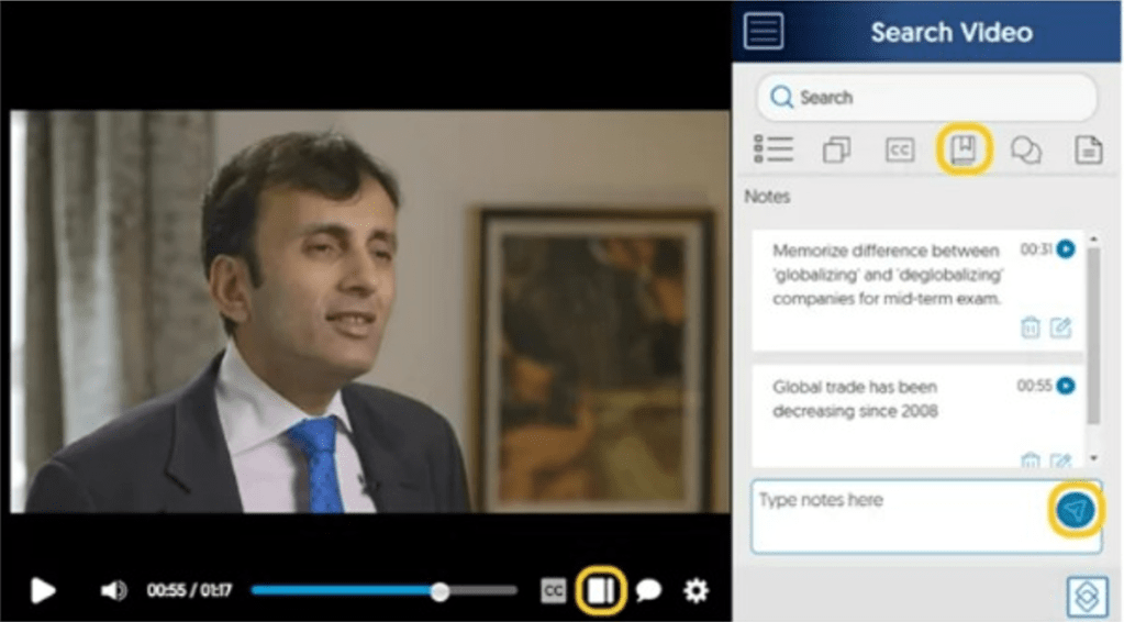
Problem 5. No option to take notes while listening to lectures
Learners find it inconvenient to take notes only when reviewing slides – accessing a video at the same time will require opening another browser tab and going through the long list of steps to load it.
Solution 5. Optimize user flow
Simulate a more natural flow by allowing users to take notes when playing a video
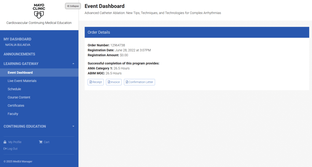
Problem 6. Unoccupied real estate conflicts with the #4 Heuristic “Consistency and standards”
Large areas of white space on webpages are often interpreted as something is broken. Some participants demonstrated confusion about this page layout. Those who said that it doesn’t bother them assumed that it doesn’t appear on mobile device. This page view doesn’t follow the Jakob’s Consistency and Standards Heuristic (aka rule), which refers to reducing users’ cognitive load by making sure their experience with a product or service matches their mind maps (aka expectations).
Solution 6. Make the page layout aligned with users’ mind maps
Help users enjoy the learning process with ease by reducing their cognitive load for non-content related information processing. Make user flow more natural and consistent with best practices of other education online platforms
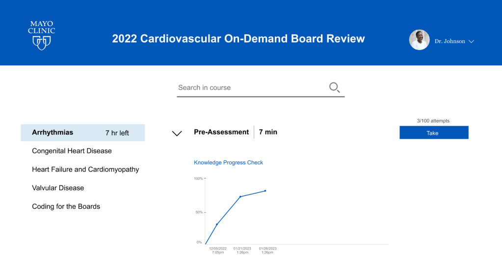
Design Update Recommendations
Based on the users’ feedback a new design for the on-demand platform was presented. This design allows a learner to:
- Take notes while watching study videos;
- Focus on the course content, not the invoice;
- Take pre-assessment to benchmark knowledge prior to watching videos;
- See the pre-assessment progress with each additional attempt;
- Easily access study videos/audio recordings without additional clicks;
- Make search withing the course;
- Monitor study progress and hours left for the module completion.
The interactive prototype is located here.